


MAP DESIGN 1: PARKS & PEOPLE FOUNDATION
The Parks & People Foundation is a nonprofit focused on improving access to public green space in Baltimore City. They needed a city-wide map that tracked both their completed public park projects and their in-progress projects. I developed the following maps and icons, for use in various contexts. The final project submission included a main Adobe Illustrator file with all layers and objects labelled. They can be turned on or off by the nonprofit’s staff communications director when slight variations on the map are needed and when new projects are added.


MAP DESIGN 2: PARKS & PEOPLE FOUNDATION
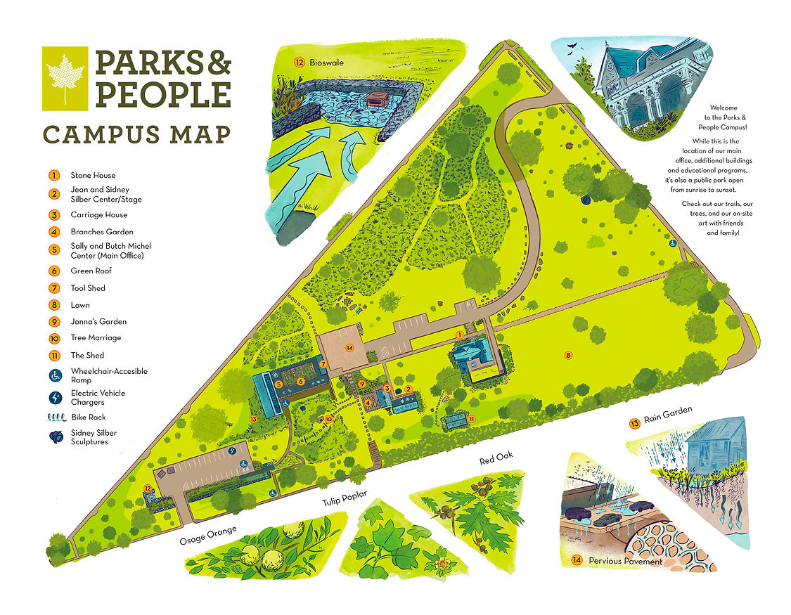
In addition to their city-wide map, Parks & People wanted a map of their office location’s campus. They wanted this map to be more “playful” and detailed than the more utilitarian city map, to emphasize that their campus is open to the public as a green space. I first had to accurately sketch the campus based on unfinished site plans and from in-person plotting of everything from buildings to individual trees. I then moved to illustrating the campus in my own style, developing shorthand icons for various items. The last step was illustrating spot diagrams highlighting various aspects of the sustainable campus.


LOGO:
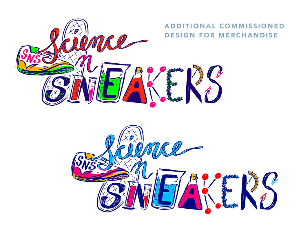
SCIENCE AND SNEAKERS, INC
I was approached by the CEO of this STEM education nonprofit to design their illustrative logo featuring both a sneaker or its tread and scientific equipment. The group’s target audience is students ranging from elementary to early college age, so bright neons were requested for the color scheme.

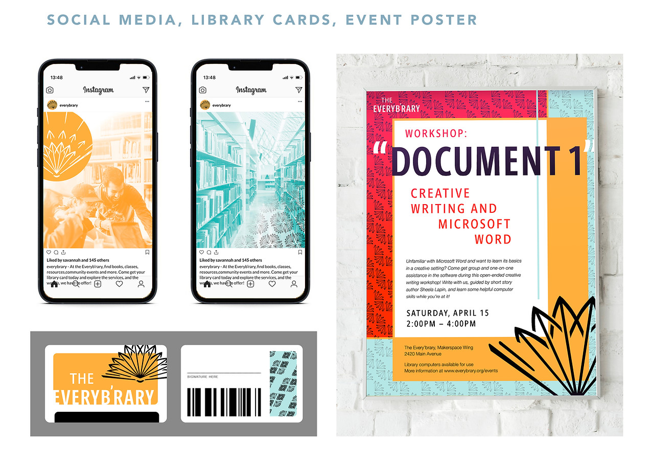
BRANDING, LAYOUT:
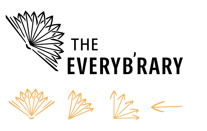
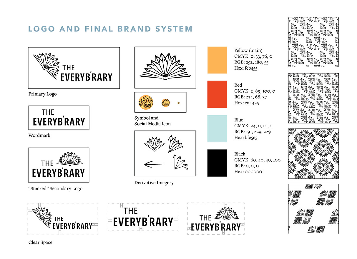
THE EVERY'BRARY
In creating a visual identity for a hypothetical public library, I aimed to emphasize libraries’ community resources. Combining “everybody” and “library” produced the name “Everyb’rary” and was a way to balance the challenge of creating a local community ethos for a library with no decided location. Books are obviously a key part of this brand, but I wanted to emphasize the full range of services a library provides a community. From this, I arrived at the book page arrow motif that became a visual throughline.


BOOK LAYOUT/ASSET DESIGN: ECHOES FROM
THE ARCHIVES
I designed and illustrated pre-press spreads and pages for co-authors Jenny Carson and Beth Burke’s in-progress book "Echoes from the Archives: Stories and Histories Told Through the Cather Family, 1851–1891". Deliverables included spread layouts, border pattern
assets, chapter title illustrations, and chapter title lettering. I based the lettering on Willa Cather’s own handwriting as seen on snapshots used in the book.


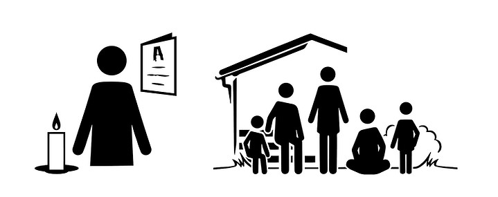
ICON DESIGN: SHINE ALABAMA
The nonprofit Alabama Forward needed four icons inclusively explaining their program for holding
careful but vital memorial candle lightings for loved
ones lost to COVID-19.


COLLABORATIVE SIGNAGE: PAINTED HAND PUEBLO
During this project, I helped design seven signs in a team with Madeleine Maule and Kate Reinard for Canyons of the Ancients National Monument archaeologist Vince MacMillan. With creative direction from Carissa Aoki, Katie O’Meara and Magnolia Laurie, these designs were brought to final after two preliminary layout trials and over 100 on-site drawings between the three of us. The final signs have been installed at the monument and are printed on aluminum with tangible bronze accents.


